Most business frustrations with design aren’t about creativity — they’re about the process. You pick up a few things after enough discovery calls, proposal decks, and ‘final’ revision rounds with design partners, so allow me to fill you in.
Graphic Design Process: Key Findings
- Clear intake and discovery can cut onboarding time nearly in half while aligning teams on goals, audiences, and KPIs from the start.
- Phase-gated workflows protect budgets and timelines by using defined milestones, approvals and time-boxed feedback.
- Design systems turn consistency into revenue by saving 20–30% of design time with reusable UI kits and templates.
Graphic Design Process Overview
I'll walk you through a business-first approach to graphic design, using a strategic framework that delivers both efficiency and results.
And I’ll clue you in on what to expect, what to ask for, and what to push back on at every stage of a design engagement.
Step-by-Step Graphic Design Process
A scalable, repeatable system is essential for delivering creative work at speed without sacrificing quality. I’ve seen the same core structure show up in the best-run projects.
Below is the six-stage framework that high-performing agencies rely on, from project kickoff to final delivery:
- Discovery and research
- Ideation and moodboarding
- Wireframing and concept development
- High-fidelity design execution
- Internal review and client feedback
- Finalization and delivery
1. Discovery and Research
When I’m evaluating agencies, I pay close attention to how they handle discovery. Good agencies don’t just ask, “What do you want it to look like?”; they dig for context.
This critical first phase includes stakeholder interviews to understand the client’s vision, brand audits of existing materials, market research, and the definition of audience personas. It’s also where the team clarifies project requirements and success metrics.
How to measure success (KPIs):
- Brief completeness is at 90% or higher: The brief covers objectives, audience, success metrics, constraints, and must-have deliverables in enough detail for the design team to start without guesswork.
- Top-task coverage at 100%: All primary user or customer tasks (e.g., “find pricing,” “download resource,” “request a demo”) are captured and reflected in the requirements.
- Critical risks documented (yes/no): Key risks and assumptions (tight timelines, missing data, brand changes, technical constraints) are explicitly captured and acknowledged by both the client and the internal team.
Common misses to avoid:
- Fluffy personas: Audience profiles that are based on anecdote instead of data (analytics, customer interviews, CRM), leading to generic or misaligned design decisions.
- No measurement plan: Success metrics are vague (“make it pop”) instead of tied to clear KPIs like conversion, engagement, or brand lift, making it impossible to judge if the work is effective.
- IA not validated against traffic reality: Information architecture decisions are made in a vacuum, without checking real traffic patterns, search behavior, or top content paths, which can result in a beautiful but hard-to-use experience.
Tools That Inform Design Decisions
| Tool | Purpose | Design Insight |
| Google Trends | Analyze consumer interest patterns over time | Use real search interest to choose topics, headlines, and campaign angles that match current demand. |
| SimilarWeb | Review competitor website performance and user behavior | Benchmark visual style, layout, and functionality expectations based on real-world usage patterns. |
| Statista | Access industry data and audience demographics | Guide design decisions by understanding platform preferences and top-performing content formats. |
2. Ideation and Moodboarding
This is when you brainstorm and visualize the design direction, turning abstract strategy into a visual language before any detailed design work begins. The team should generate early ideas through sketches or mind-maps and compile moodboards that set the tonal and visual direction.
Ideation is where strategy meets creativity. Moodboards act as a visual first draft of the project’s look and feel, allowing the your team and the agency to align on style before investing time in full designs. It helps to avoid that “I don’t like it” feeling on a near-final design.
How to measure success (KPIs):
- Decision within about a week: From the moment the agency shares routes, you should be able to choose one clear direction within seven days. Any longer and the project risks losing momentum.
- Minimal rework on colour and type: Once you’ve agreed a palette and typography, fewer than roughly 10% of those choices should need changing later. If you’re constantly revisiting basics, ideation wasn’t tight enough.
Common misses to avoid:
- Blurred territories (everything looks the same): If all the routes feel like minor variations, it’s very hard to choose. Ask the agency to make each option clearly distinct, with a simple explanation of how one route differs from the others.
- Palettes that fail contrast: Pretty colors that are hard to read won’t work in the real world. Make sure the agency checks contrast and basic accessibility so buttons, body text, and key UI elements are clearly legible.
- Picking a style without content reality: Be cautious if styles are shown only with lorem ipsum or ideal mock content. Insist on seeing them tested with real headlines, data, product images, and UI components, otherwise you won’t know if the design holds up with actual content.
Visual Thinking Tools
| Tool | Purpose | Design Insight |
| Milanote | Collect ideas, references, and notes in one shared visual space. | Gives you and your agency a single place to shape the look and feel of a project before full designs. |
| Collect visual inspiration from across the web into themed board. | Helps you quickly show your agency what you like to speed up alignment on style. | |
| Behance / Dribbble | Explore real-world design projects and portfolios from creatives worldwide. | Use them to benchmark quality and share examples of the level and style you expect. |
3. Wireframing and Concept Development
@uiux.designer60 When Ideas Start to Make Sense 🚀 Sketching helps me get thoughts out fast, but wireframing is where everything starts to connect.🤩 It’s when messy inspiration turns into something functional.🙌 That’s the moment I know an app idea can actually work. 🙂↔️ 👇 What helps you turn raw ideas into structure? #UXDesign#Wireframing#UIUXDesign#DesignThinking#ProductDesign♬ BETA 777 - beaty
The design team should start by building low-fidelity wireframes or sketches to map out the structure of the design before diving into detailed visuals. Think of this as a simple, visual plan that maps out structure and content placement.
This phase helps catch structural issues early before investing time in final design. It’s much easier and more cost-effective to adjust a wireframe than to revise a finished piece.
I also like to treat wireframes as a checkpoint to confirm that all required content and components are included and logically arranged.
How I measure success (KPIs):
- Primary CTA is visible without scrolling: On both mobile and desktop, the main action (e.g. “Contact”, “Buy”, “Book”) should always sit above the fold, so people see it instantly.
- At least 70% get their first click right: In quick first-click tests on key tasks, at least 7 out of 10 people should click where we hoped they would.
- Around 80% can find what they need: In fast, informal nav checks, at least 8 out of 10 people can complete core navigation tasks without getting stuck.
Common misses to avoid:
- Beautiful wires with no copy: If the wireframes are full of lorem ipsum, you’re not really testing the idea. Ask the agency to use real or realistic copy early so you can see if the message and structure actually work.
- No state coverage: Seeing only the “perfect” version hides risk. Make sure they’ve thought through key states (empty, error, loading, edge cases) so there are no nasty surprises later in design or build.
- Skipping mobile reality: If everything is shown in desktop frames, assume mobile has been deprioritised. Ask to see how flows, CTAs, and key modules behave on small screens, not just a squeezed-down desktop layout.
Tools for Wireframing and Flow Mapping
| Tool | Purpose | Design Insight |
| Figma | Collaborative design tool for interactive wireframes and clickable prototypes | Lets you experience early journeys as your customers would and give feedback before anything is built. |
| Adobe XD | Prototyping and wireframing tool with smooth collaboration features | Helps validate navigation and screen structure so fewer changes are needed later in the process. |
| Miro | Digital whiteboard for mapping user journeys, brainstorming, and sketching sitemaps | Keeps stakeholders aligned on what the experience should do before visual design starts. |
4. High-Fidelity Design Execution
This is the core creative production stage, transforming ideas into tangible visuals. This phase is where design craft truly shines by creating pixel-perfect mockups, illustrations, or layouts based on the earlier plan. The team also ensures alignment with brand guidelines or develops new style guides if it’s a branding project.
You should also see them thinking ahead to handover: well-organized files, reusable components, and clear documentation so developers or in-house teams can implement without guessing.
How I measure success (KPIs):
- Defect rate from design QA < 5 per template: When you or your dev team review the files, you’re finding only a handful of issues per template (alignment, spacing, wrong styles, missing states, etc.).
- Re-use ratio ≥ 60%: At least 60% of what’s in the final designs is built from reusable components and patterns, not one-off artwork. This shows they’re designing a system, not just a series of disconnected pieces.
Common misses to watch for:
- Style drift from the moodboard: The final designs no longer feel like the direction you originally approved. Screens should still clearly reflect the chosen moodboard and route.
- Token-less one-offs: Colors, type sizes, and spacing values appear once and never again. This makes the system harder to maintain and extend. Ask whether new styles are being added to a token system or just dropped in.
- Inaccessible color on overlays: Text on images or tinted panels looks great in Figma but is hard to read in practice. Check contrast on buttons, labels, and overlay text, especially on photography.
- No mobile parity: Desktop designs look polished, but mobile feels cramped, broken, or like an afterthought. Make sure key layouts, CTAs, and interactions are considered properly on small screens, not just “shrunk down” from desktop.
Tools for Graphic and Interface Design
| Tool | Purpose | Design Insight |
| Adobe Illustrator | Create sharp, scalable vector graphics | Ensures core brand assets stay sharp and consistent across print, web, and large formats. |
| Adobe Photoshop | Edit and create raster-based visuals | Enables polished imagery for campaigns, social, and ads that still fits your brand. |
| Sketch | Mac-based UI/UX design tool with strong component management | Supports reusable UI libraries so your product or website looks and feels consistent everywhere. |
5. Internal Review and Client Feedback
At this stage, the agency should be pressure-testing the work before it reaches you, then guiding a focused round (or two) of client feedback, not opening the door to endless tweaks.
You’re looking for a calm, structured loop: they review internally, you respond once with consolidated comments, and the work moves forward rather than circling.
How to measure success (KPIs):
- Rework ratio < 15%: Ideally fewer than 15% of screens or templates should need major changes after each feedback round. If most of the work is being re-done, something upstream (brief, discovery, or alignment) is off.
- Subjective “taste” comments < 30% of total: The bulk of feedback should be about goals, users, clarity, and constraints, not “make it pop” or “I don’t like green.” If more than a third of comments are purely taste-based, your decision-making framework isn’t strong enough.
- Turnaround met ≥ 90%: At least 9 out of 10 feedback cycles should hit the agreed response date on both sides (agency and client).
Common misses to avoid:
- Parallel feedback streams: Different stakeholders send comments separately (Slack, email, Figma, PDFs), and the agency ends up trying to reconcile conflicting directions. Aim to give one consolidated, prioritized round of feedback per cycle — ideally from a single point of contact.
- 'Quick little changes' that reset systems: Small-sounding requests (like “just tweak this heading size”) can quietly break the design system, forcing hidden rework across dozens of components. Ask the agency to flag when a change has system-wide impact.
- Unlabeled severities: When everything is presented as equally urgent, teams either fix too little or burn time on the wrong things. Ask for (or provide) simple labels like must-fix / important / nice-to-have so everyone is the on the same page.
Jamie Walker, Co-Founder and Digital Director of Studio Twofold, emphasized that above all, agencies should aim to do right by their clients. He explained that if there's an opportunity to elevate a design by spending a little extra time, they should.
“Think of it as adding a cherry on top of an already delicious sundae,” he advises agencies. That kind of care and communication leads to high client satisfaction, he explains, and more often than not, organic growth through referrals.
Tools for Clear Collaboration
| Tool | Purpose | Design Insight |
| Slack | Perfect for quick, real-time communication. | Ideal for clarifying small tweaks, replacing long email threads. |
| Loom | Great for recording walkthroughs of design work. | Helps your agency explain design choices in minutes, so you can respond without long meetings. |
| InVision | Enables clients to leave contextual, in-design feedback. | You click on specific areas to give feedback, making comments clearer and easier to action. |
| Notion | A centralized project hub for feedback, revisions, and next steps. | Acts as a single source of truth for timelines, feedback, and next steps across your design projects. |
6. Finalization and Delivery
Proper finalization prevents post-project headaches. If you later discover that files are missing, unusable, or set up incorrectly (like a print PDF isn’t in CMYK, or exported graphics are blurry), you’ll be forced into delays, extra costs, and a frustrating back-and-forth.
I always push for a clear hand-off process: thorough QA on all final files and a clean, logical folder structure so your team (or any future designer) can quickly find and reuse assets.
Tools for Seamless File Delivery
| Tool | Purpose | Design Insight |
| Google Drive | A go-to for sharing final files with clients in a well-organized structure. | Gives your team secure, organized access to assets, with permissions for partners and vendors. |
| Dropbox | Preferred for reliable syncing and robust version history. | Makes it easy to share large design files and roll back to previous versions if needed. |
| WeTransfer | Great for one-off file deliveries without requiring logins or folder access. | Ideal for receiving one-off deliveries like print-ready files or campaign exports without managing shared drives. |
How a Strategic Design Process Drives Business Results
When strategy guides creativity, design stops being a gamble and starts acting like a growth lever. A strong, transparent process from your agency means work is memorable as well as measurable, tied directly to your goals, timelines, and budget.
Below is how a process-driven approach pays off for your business, and what it costs you when workflows are messy behind the scenes.
Why Process-Driven Design Works for Your Brand
You’re not just buying creative; you’re buying clarity, confidence, and results. A well-defined design process delivers all three:
- Predictability builds trust (and speed): When your agency works from a clear workflow and timeline, it’s much easier to plan launches and campaigns. A standardized intake and onboarding process can cut client onboarding time nearly in half, simply because everyone knows what’s expected from day one.
- Defined milestones prevent scope creep: Clear phases and approval checkpoints keep projects from quietly expanding beyond the budget or timeline you agreed to. Scope creep is a major culprit in project overruns as over half of projects face uncontrolled scope changes without strong management. A process with firm milestones protects both your costs and your launch dates.
- A structured process ties design to your business goals: A strategic workflow ensures each design decision maps back to your brand strategy and objectives. When you’re following a roadmap you agreed on up front, the final work supports your business outcomes rather than someone’s personal taste.
This is one of the first things I look at when I’m evaluating an agency, not just what they’ve designed, but how they get there.
The Hidden Costs of Poor Workflow (That You Still Pay For)
Even if the workflow problems live inside the agency, your business feels the impact through delays, extra meetings, and weaker results.
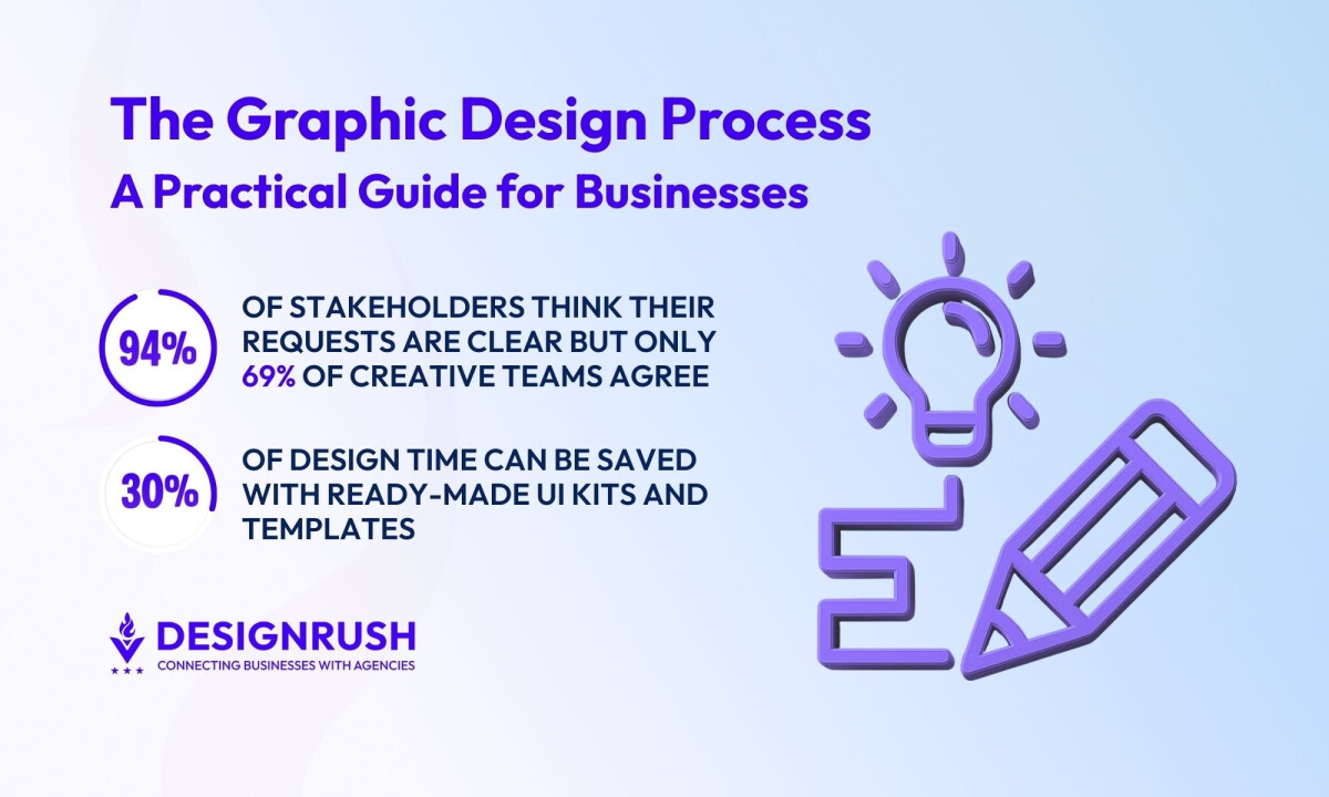
- Wasted time on unclear briefs and scattered revisions: Without a solid brief and feedback system, teams spin their wheels. There’s a big perception gap: 94% of project stakeholders believe their initial requests are clear, but only 69% of creative teams agree. Every hour spent clarifying or chasing feedback is an hour your campaign isn’t in market.
- Lost value from rework and low throughput: Inefficient workflows that require multiple major revision cycles eat directly into the value you get from your budget. Designer hours go into fixing misalignment instead of creating new assets and campaigns, so you effectively get less output for the same spend.
- Inconsistent assets that hurt brand and revenue: When processes are weak, you get off-brand, inconsistent assets that make your brand feel less credible. Research shows that maintaining a consistent brand presentation across all platforms can increase revenue by up to 23%.
 From my perspective, asking about process is one of the most underrated ways to protect your marketing budget. A smooth, strategic workflow is often the difference between “nice designs” and design that actually moves the needle for your business.
Efficient Workflows That Protect Your Design Budget
Small process choices have a big impact on how smoothly projects run, how much they cost, and how strong the final work is. These are the kinds of systems that protect your time and budget while improving results.
- Use Milestone Approvals, Not Endless Back-and-Forth
- Make Sure Files Are Organized and Usable Later
- Invest in Reusable Design Components, Not One-Off Assets
- Integrate Feedback Early and Make It Goal-Driven
- Expect Automation for the Busywork
1. Use Milestone Approvals, Not Endless Back-and-Forth
Ask your agency to structure the project into clear phases (e.g., discovery, concept, design, refinement, handoff) with defined deliverables at each step and a formal sign-off before moving on.
Look for:
- Clear deliverables per phase (e.g., moodboard, wireframes, final designs).
- Approval gates — once you approve a phase, major changes are treated as new scope (so you’re not quietly charged for late changes).
- Timeboxed feedback — for example, you have 3–5 business days to review and respond.
For you, this means fewer surprises at the end and natural checkpoints to confirm the work is still aligned with your goals.
2. Make Sure Files Are Organized and Usable Later
Keep in mind that you aren't just buying a design, you’re buying assets your team will reuse for months or years. Sloppy file organization can make that painful.
Ask your agency to:
- Use a standard folder structure across all projects (e.g., /Concepts, /Final, /Social, /Print).
- Agree on file naming conventions that make sense (versioning, dates, channels, etc.).
- Keep layers and components logically grouped in design files.
This makes it easy for your internal team or another vendor to pick up the work without starting from scratch.
3. Invest in Reusable Design Components, Not One-Off Assets
If you expect ongoing design needs, push for systems, not just individual pieces.
While it takes upfront effort, it pays off on every project. In fact, using a ready-made UI kit or design system can save around 20–30% of design time on average and in some cases much more.

Examples of what to ask for:
- A design system or UI library for your website or product (buttons, forms, grids, typography, colors).
- Brand templates for social posts, presentations, ads, and sales collateral.
It may cost a bit more upfront, but it pays off in faster turnarounds, more consistent visuals, and less “reinventing the wheel” every time you need something new.
4. Integrate Feedback Early — and Make It Goal-Driven
I’ve seen how badly a project can be derailed when clients only provide feedback at the final presentation. Instead, look for an agency that builds in early, low-stakes check-ins: sketches, moodboards, or rough layouts.
On your side:
- Share goal-focused feedback:
- “Does this help us look more premium?”
- “Will this be clear to first-time customers?”
- Consolidate internal feedback before sending it to the agency so they’re not juggling conflicting opinions.
- Agree upfront on how many revision rounds are included. This keeps the project focused and encourages thoughtful feedback.
Early alignment reduces last-minute changes, keeps costs in check, and leads to designs that actually work in the real world.
The advice from Brock Smith, co-founder of Oculus Studios, is to find a branding partner who listens to your needs with the same passion as your team. He says:
“It's all about collaborative creative ideation and beta testing with current and potential customers. This way, you get real feedback and can fine-tune your approach.”
5. Expect Automation for the Busywork
A good agency uses tools and automation so your project doesn’t stall on logistics.
According to a Slack State of Work report, 77% of workers say automating routine tasks boosts their productivity, saving an estimated 3.6 hours per week per person.

This can look like:
- Automatic status updates and reminders for approvals.
- Project management tools that track tasks, timelines, and owners.
- Streamlined asset delivery (e.g., one organized link instead of scattered email attachments).
You don’t need to manage the tools yourself, but you should feel the effects: fewer dropped balls, clearer communication, and more of everyone’s time going into strategy and creative thinking instead of chasing files and emails.
Final Thoughts: From Chaos to Creative Control
A modern brand needs the right systems and partners in order to grow. Choosing an agency with a clear, repeatable design process gives you consistency, faster delivery, and smoother collaboration.
When design is run by strategy instead of chaos, it stops being a string of one-off requests and becomes a reliable engine for launches, campaigns, and long-term brand growth. You get predictable timelines, clear communication, and creative work that’s tied to real business results.
![]()
Our team ranks agencies worldwide to help you find a qualified partner. Visit our Agency Directory for the Top Graphic Design Companies, as well as:
- Top Design Agencies
- Top Web Design Companies
- Top Product Design Companies
- Top Logo Design Companies
- Top Digital Agencies
Our design experts also recognize the most innovative design projects across the globe. Visit our Awards section to see the best & latest in design.
Graphic Design Process FAQs
1. Why should my business care about an agency’s design process?
Because the process is what protects your time, budget, and sanity. A clear workflow reduces scope creep, keeps deadlines on track, and makes sure every design decision ties back to your goals, not just aesthetics. When an agency shows you a structured process, they’re really showing you how they’ll protect your investment.
2. What should I expect in the discovery and onboarding phase with an agency?
A good agency won’t jump straight into visuals. They’ll ask about your business model, audience, priorities, and success metrics; review your existing brand assets; and clarify timelines, deliverables, and constraints. By the end of discovery, you should have a solid brief both sides agree on and a shared definition of “success” for the project.
3. How does a structured design process help my budget and timeline?
Phase-based workflows with clear milestones and approvals keep projects from ballooning. When each stage (discovery, moodboards, wireframes, design, revisions, handoff) has defined deliverables and sign-off, major changes after approval trigger a scope or timeline conversation instead of silent overages. That means fewer surprises on your invoice and a higher chance of launching on time.