UnitBank is a forward-thinking digital banking concept built to rethink how people manage their money in a space where many apps still feel cluttered or outdated. To support that vision, Digineat created a clean and intuitive mobile experience centered on clarity, ease, and emotional comfort.
Industry Insight: As smartphone use rises and mobile becomes the main banking channel, 58% of users prefer apps that remember their preferences. Digineat’s contextual, memory-friendly UX meets that expectation and helps UnitBank feel like a reliable daily companion.
Unitbank App Design: Key Findings
Soft Gradient UI That Builds Calm and Trust
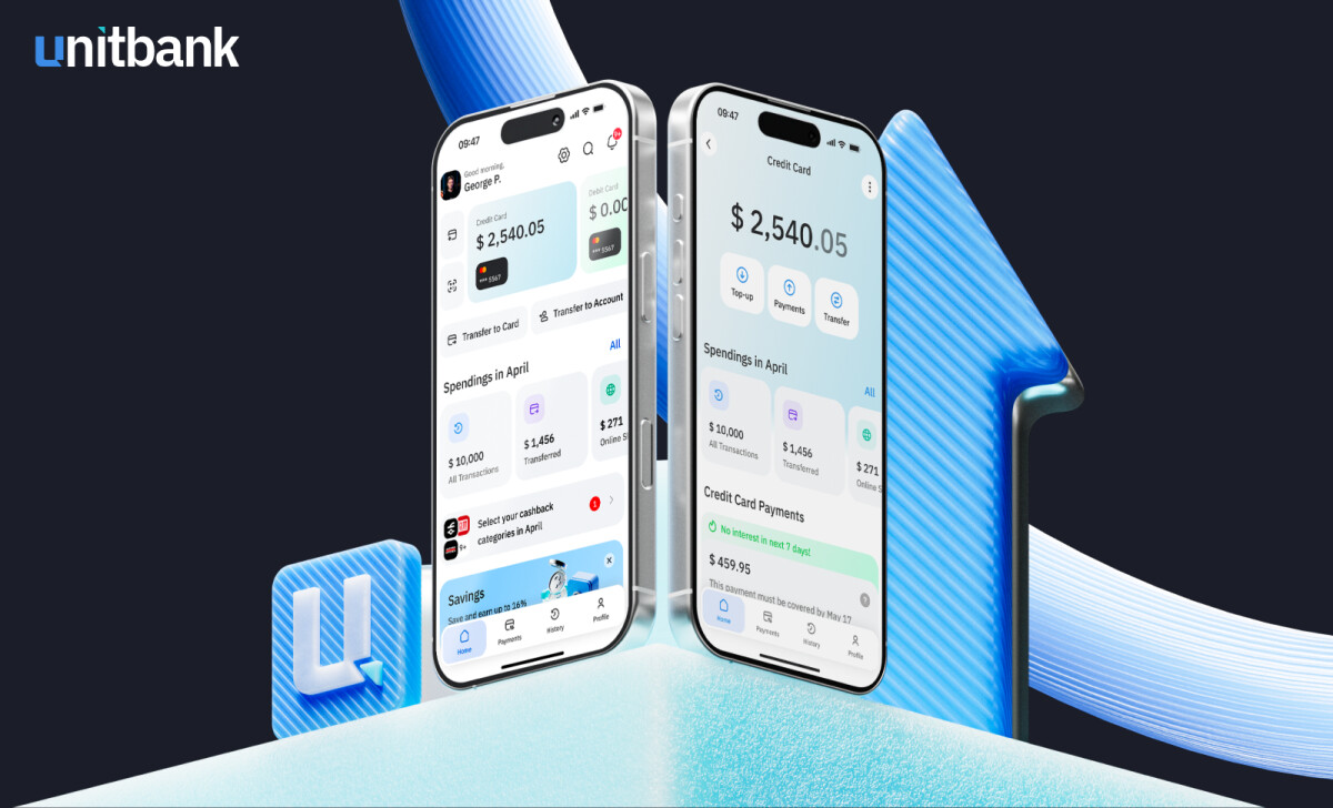
Digineat applies gentle gradients such as sky blue to ice blue across balance cards, savings modules, and account summaries. Paired with light overlays and set on white or near-white backgrounds, these elements appear to float, giving the interface a clean and premium tone.
Instead of relying on heavy flat color blocks that many banking UIs use, the soft gradients introduce visual comfort and calm, reducing the tension people often associate with finances. This choice aligns well with color research showing that 54% of consumers consider blue the most trusted brand color.
This approach also lifts the brand, making the experience feel closer to a modern fintech product rather than a traditional banking interface.
Simple Onboarding That Balances Clarity With Confidence
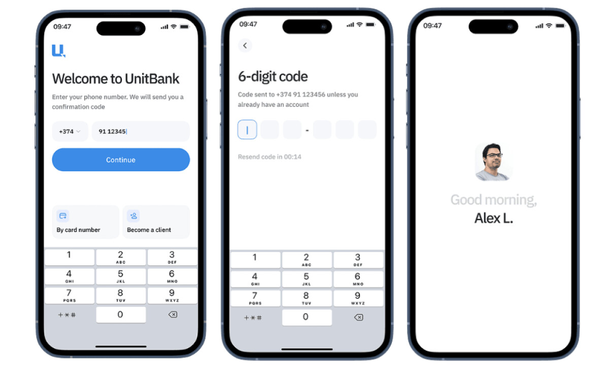
From the very first interaction, UnitBank keeps things clear and calm. Large input fields, concise copy, and generous whitespace help new users move confidently through registration. Personalized greetings with user photos add emotional warmth without over-personalizing.
“Clean layout and larger font for excellent UI interface. Easy prompts, navigation and intuitive features foster trust.”
— Andrea Owsinek-Brucker, DesignRush Awards Jury
With users making design judgments in 50 milliseconds, this frictionless onboarding builds credibility fast. The structure focuses on micro-decisions such as confirming a phone number, and each step is delivered without clutter or overexplanation.
By reducing cognitive load during account setup, UnitBank increases the likelihood of conversion and satisfaction — critical benchmarks in the competitive finance app space.
Modular Card-Based Layout for Clarity and Scalability
-desktop.jpg)
Once inside the app, the home screen and account dashboards rely on a modular grid and card-based layout. Information like recent transactions, spending summaries, payment options, and account tools are each given their own “card.” These cards use consistent spacing, rounded edges, and only essential icons and labels
This structure allows users to scan key financial data quickly instead of digging through nested menus or dense lists. The modular system also supports scalability, so as UnitBank adds new features, the layout can expand without losing coherence.
Explore more of the best app designs to see how leading brands are reshaping UX in fintech and beyond.
3D Icon System That Humanizes Fintech Tasks
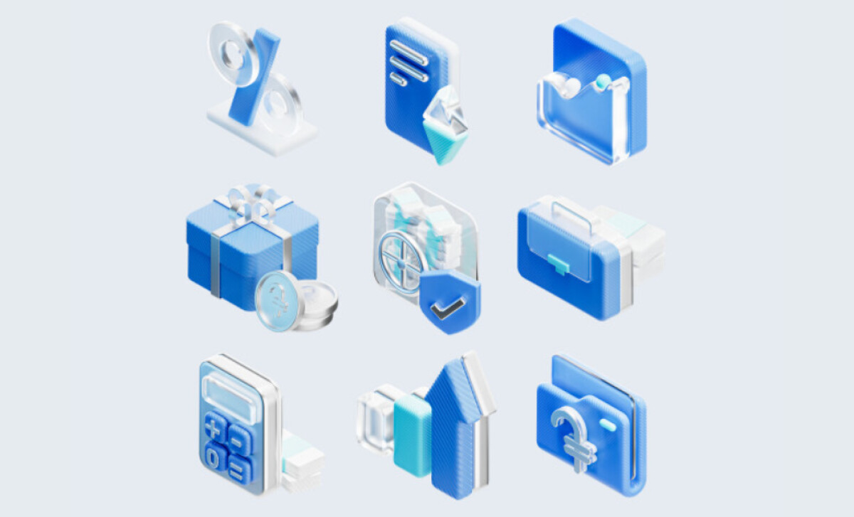
UnitBank’s suite of 3D icons, including percent signs, briefcases, and calculators, adds visual richness without feeling gimmicky. These assets use glassy textures, soft lighting, and uniform blue tones to maintain coherence and polish.
Unlike flat icon sets, these tactile elements act as intuitive cues that enhance recognition and comfort throughout the app. This visual language helps UnitBank feel approachable and human, adding subtle personality to everyday interactions.
The icon system also becomes a recognizable brand asset, giving UnitBank a distinct presence in a landscape filled with generic banking tools.
Impact & Results
UnitBank serves as both a concept and a forecast for where regional fintech is heading.
Even as a prototype, UnitBank demonstrates how thoughtful UX can rewrite how people relate to money: less stress, more clarity.
What Brands & Agencies Can Learn from UnitBank
Here are a few lessons from how this app approaches modern finance design:
1. Use Soft Visuals to Reduce Anxiety in High-Stakes Experiences
Gradients, gentle spacing, and calm color palettes help make financial workflows feel less intimidating, especially for new users. These visual cues set the emotional tone before any data appears and build trust early in the journey.
2. Adopt Modular Information Cards for Long-Term Flexibility
A card-based system allows features to expand or shift without disrupting the layout. This gives teams the ability to evolve the product as new needs or expectations arise.
3. Introduce Signature Visual Assets to Build Identity
A carefully designed 3D icon set or a consistent card treatment can become a recognizable brand element. When used with restraint, these assets also support understanding by giving users clear visual cues for complex financial tasks.
About DesignRush Featured Designs
At DesignRush, we feature digital products that show restraint, intelligence, and purpose.
DigiNeat's UnitBank app does exactly that: using design not as decoration but as literacy. It turns something as intimidating as finance into something understandable, and that’s no small accomplishment in fintech.
Fintech startups, banks, and enterprise platforms can find more case studies like UnitBank in these collections of data-driven, user-first designs:
- Best App Designs
- Best Website Designs
- Best Logo Designs
- Best Print Designs
- Best Packaging Designs
- Best Video Designs
For a full list of design agencies and related services, visit our Agency Directory.