Research Infographics: Key Points
- Investor decks convert better with infographics, visual aids make presentations 43% more persuasive.
- 57% of marketers use infographics to boost visibility, turning LinkedIn posts and lead magnets into engagementdrivers.
- Visualizing client results improves retention and trust, reducing churn across high-value retainers.
Modern decision-making demands clarity, and visuals significantly enhance comprehension and retention, making research infographics a fast, effective tool for turning complex data into strategic buy-in.
This article unpacks how agencies, consultants, and brand leaders can use research infographics to turn complex research into actionable visuals, align teams, and close deals faster.
Quick-Glance Guide to Infographic Formats by Use Case
Before diving into the full list, here’s a streamlined look at five key infographic types and when to use them—based on their impact, clarity, and business fit.
Now let’s explore all ten infographic formats in depth, with real-world examples that show how each one supports persuasive, insight-driven storytelling.
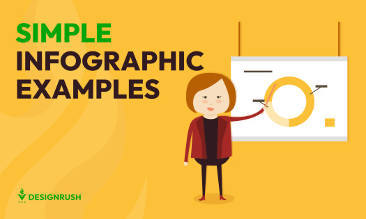
1. Statistical Infographics
- Purpose: Convert complex quantitative data into clear, branded visuals for quick stakeholder comprehension
- Use when presenting: Survey data, market research, platform analytics
- Ideal for: Investor updates, annual reports, “State of the Industry” content
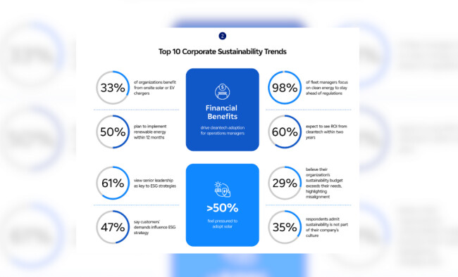
Example: PowerFlex’s 2025 State of the Industry animated infographic presents insights from 400 corporate decision-makers into a concise visual narrative on cleantech adoption and ESG trends.
Why it works:
- Breaks down layered data into digestible visual blocks
- Utilizes icons and subtle animations to maintain engagement
- Presents enterprise-scale research in a format suitable for executive audiences
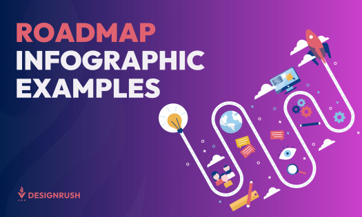
2. Roadmap and Insight Trend Infographics
- Purpose: Illustrate progression, preference shifts, or maturity levels across multi-phase frameworks
- Use when presenting: User sentiment across adoption stages, behavioral data tied to product evolution, or strategic technology rollouts
- Ideal for: Product development roadmaps, UX research, innovation strategy reports
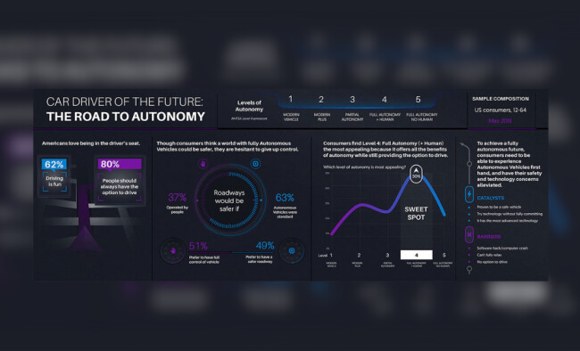
Example: A research infographic by Vital Findings showcases consumer readiness for autonomous vehicle adoption using the NHTSA’s 5-level autonomy framework.
Why it works:
- Anchors viewers with clear progressive levels (1–5)
- Integrates statistics and behavioral insights at each stage
- Highlights adoption barriers and catalysts through strategic segmentation
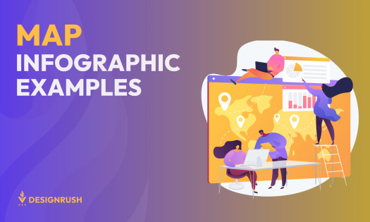
3. Geospatial Infographics
- Purpose: Depict regional disparities and advancements in global initiatives
- Use when presenting: Comparative regional data, progress metrics across countries, impacts of global programs over time
- Ideal for: International development reports, public health campaigns, global strategy presentations
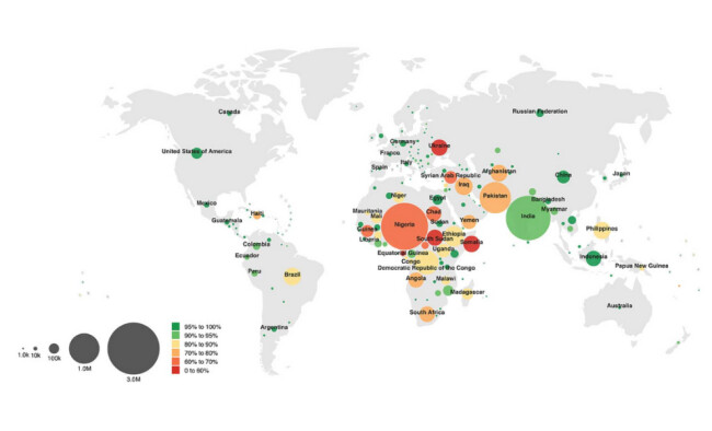
Example:Stamen's infographic for the WHO illustrates global immunization efforts, combining geographic mapping with statistical data.
Why it works:
- Provides geographic context to data
- Displays temporal changes and trends effectively
- Uses clear indicators (size and color) to identify areas of success and those needing attention
4. Financial Report Infographics
- Purpose: Present revenue streams, operational costs, and profit breakdowns in an accessible format
- Use when presenting: Quarterly earnings, investor briefings, financial health snapshots
- Ideal for: Investor relations, CFO dashboards, internal financial reviews
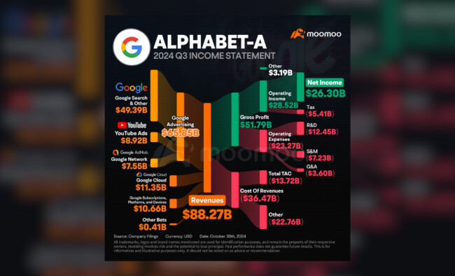
Example: Moomoo's infographic dissects Alphabet’s Q3 2024 earnings, illustrating the flow of $88.27B in revenue through various segments.
Why it works:
- Employs a Sankey-style flow diagram for clarity
- Segments income sources and cost categories distinctly through color contrast
- Uses font size difference to emphasize key financial outcomes
5. Business Model Infographics
- Purpose: Deconstruct a company's revenue generation, allocation, and retention strategies
- Use when presenting: Revenue composition, cost breakdowns, margin structures
- Ideal for: Investor decks, public earnings summaries, internal performance reviews
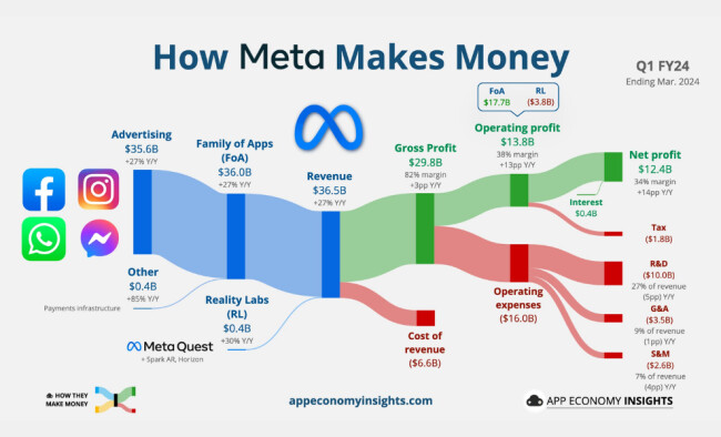
Example: App Economy Insights' breakdown of Meta’s Q1 FY24 results maps inflows and outflows across its segments.
Why it works:
- Traces revenue from source to net profit seamlessly
- Incorporates growth rates and margins for context
- Uses color-coding to organize data (income, expenditure, and profit)
6. Process Infographics
- Purpose: Simplify complex scientific or medical processes for diverse audiences.
- Use when presenting: Cause-effect relationships, treatment workflows, product mechanisms.
- Ideal for: Health communications, science education, pharmaceutical marketing.
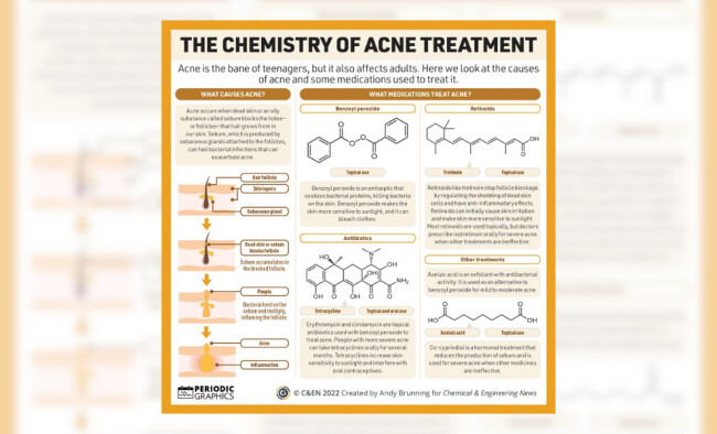
Example: Chemical & Engineering News' infographic explains acne formation and treatment options through a dual-panel structure.
Why it works:
- Maps complex sequences into step-by-step illustrations
- Blends chemical diagrams with plain-language explanations
- Segments treatment options for easy navigation
7. Projection Infographics
- Purpose: Visualize future impact targets by combining current baselines with projected outcomes
- Use when presenting: Corporate responsibility goals, strategic initiative milestones, impact forecasts
- Ideal for: Brand strategy reports, investor communications, CSR storytelling
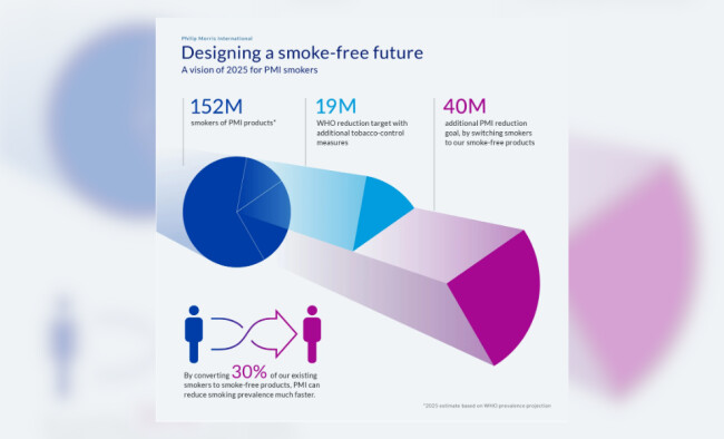
Example: Revved's design outlines Philip Morris International's 2025 vision to reduce smoking prevalence through product substitution.
Why it works:
- Visualizes impact scaling effectively
- Combines pie charts and color to differentiate the sectors involved
- Uses color gradient to demonstrate the conversion goals
8. Company Snapshot Infographics
- Purpose: Summarize a company's investment thesis, performance, and valuation in a single dashboard
- Use when presenting: Equity overviews, KPI summaries, startup pitch snapshots
- Ideal for: Investor relations, equity analysts, fundraising decks
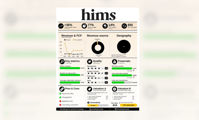
Example: Investing Visuals' infographic for HIMS presents financial performance, subscriber metrics, and valuation context.
Why it works:
- Translates equity research into visual categories
- Balances analytical data with editorial clarity
- Uses iconography and color-coded valuation bands and sentiment callouts
9. Case Study Infographics
- Purpose: Narrate business success stories from challenge to outcome
- Use when presenting: Client solutions, product rollouts, supply chain wins
- Ideal for: Sales enablement, pitch decks, B2B marketing
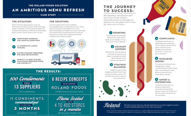
Example: Heather Stewart's infographic for Roland Foods details the nationwide refresh of a hot dog program.
Why it works:
- Deconstructs execution roadmaps into intuitive sections
- Pairs outcome stats with operational insights
- Utilizes color and illustration that aligns with the client's visual identity
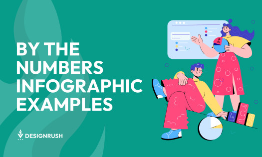
10. Survey Summary Infographics

- Purpose: Transform research findings or survey results into a visual format that accelerates stakeholder understanding and aligns teams around key priorities
- Use when presenting: C-suite surveys, market insights, employee sentiment, or transformation diagnostics
- Ideal for: Executive briefings, board decks, internal comms, and thought leadership content
Example: McKinsey’s by-the-numbers infographic translates complex generative AI adoption research into a structured visual report, spotlighting gaps between executive assumptions and employee readiness.
Why it works:
- Breaks down multi-dimensional research into four thematic sections
- Leverages ratios, deltas, and bold percentages to support rapid comprehension
- Connects leadership narratives with employee data to build a case for change
Where to Use Research Infographics for Maximum ROI
In Investor and Boardroom Presentations
- Replace dense slides with timeline and stat visuals: Visuals can make presentations 43% more persuasive than those without visual aids.
- Frame traction visually to increase credibility and buy-in: Infographics distill complex data into digestible formats, facilitating quicker decision-making. A recent study found that 64% of viewers made instant decisions after seeing presentations that included an overview-style visual map.
Across Marketing and Thought Leadership Content
- Share persona-based or trend infographics on LinkedIn to build brand authority: Infographics are used by 57% of marketers, equaling the use of long-form articles.
- Use them as lead magnets or carousel posts to improve reach: Engaging visuals can enhance content shareability and audience engagement.
Inside Client Reporting and Retainer Deliverables
- Simplify performance dashboards, campaign metrics, or creative results: Infographics aid in immediate comprehension and long-term retention of information.
- Reduce churn by improving data visibility and perceived value: Clear visuals help clients understand outcomes, reinforcing trust and satisfaction.
How to Make an Infographic Boardroom-Ready
These five principles elevate your infographic from good-looking to business-critical:
- Visual hierarchy: Prioritize high-level insights at the top to capture attention immediately.
- Brand cohesion: Align colors, fonts, and tone with your brand identity to maintain consistency.
- Scan-friendly structure: Utilize icons, whitespace, and concise labels for quick readability.
- Data credibility: Source every data point and cite clearly to establish authority.
- Presentation optimization: Ensure legibility across mobile devices, slides, and print formats.
Research Infographics: The Bottom Line
Research infographics turn raw data into strategic visuals, helping leaders make fast, informed decisions. Whether you're pitching a vision, closing a deal, or scaling your next big move, these visuals aren't just helpful, they're the difference between being heard and being hired.
Research Infographics: FAQs
1. What’s the real business value of research infographics?
They translate data into decision-ready visuals, enabling marketing directors, startup founders, and analysts to quickly share key insights across internal and external communications.
2. Which infographic types work best in pitch decks?
Timeline, statistical, and roadmap infographics showcase growth, traction, and differentiation in a format that builds confidence.
3. How do infographics help agencies and startups grow?
They support lead generation, improve client reporting, and increase brand authority when backed by research and designed clearly.
4. Can infographics replace full decks or reports?
No, but they improve them. Infographics highlight key insights, enabling faster stakeholder understanding and better content retention.