
Black and White Logos: Key Points
- Black and White Logos Drive Global Brand Recall: Apple’s black-and-white logo achieved 100% recognition among millennials in 2023, while Nike’s Swoosh ranks among the top four most recognized U.S. logos, proving high-contrast simplicity delivers exceptional recall and cross-market scalability.
Monochrome Systems Reduce Cost and Boost Speed to Market: Black-and-white logos cut print and packaging costs by up to 75% and streamline compliance reviews, enabling faster product rollouts and brand consistency across physical and digital touchpoints.
Brand Value Correlates with Visual Restraint: Iconic brands like Chanel ($60B brand value), Jordan ($6.4B+ division), and The New York Times (10M subscribers, $2.59B revenue) all lean on black-and-white brand identities to reinforce authority, exclusivity, and cultural cachet.
Catch the key takeaways on the go.
We break down why black and white logos outperform — from cost-saving design principles to the global brand strategies behind Apple, Nike, and more.
Listen to the full audio summary on Spotify.
Clarity converts. While palettes change with every trend cycle, monochrome logos do one thing well — they last. They're cheaper to produce, easier to scale, and harder to screw up.
If you're building fast or rebuilding smart, go simple. Go strong. Here's how top brands and agencies use black and white to win.
1. Chanel: Balanced elegance in an interlocked monogram
Two mirrored Cs create symmetry, recognition, and timeless luxury — all without using color.
- ROI Impact:
- Brand Value: Data shows Chanel as the third most valuable luxury brand with a brand value of about $60 billion.
- Brand Equity: Anchors Chanel’s positioning in the projected $495B global luxury market.
- Steal Their Strategy: Build a shape-based mark that can sit confidently on premium packaging and collateral without depending on trend-driven palettes.
2. Apple: Global simplicity in a silhouette
The apple shape, stripped to black or white, remains instantly recognizable across every product line and region.
- ROI Impact:
- Visual Distinctiveness: Apple’s logo scored 100% millennial recognition worldwide in a 2023 survey, confirming its dominance in visual recall.
- Brand Leadership: Apple was valued at approximately $1.02 trillion in 2024, reflecting about a 15% year-over-year increase, confirming its status as one of the world’s most valuable brands.
- Steal Their Strategy: Design with iconography that scales across platforms, dark mode, and languages — no color, no complications.
Know your mark. Choose the logo type that builds your brand — faster
3. Nike: Movement captured in a single curve
The Swoosh captures motion and energy using a bold, standalone stroke.
- ROI Impact:
- High Recall: Nike’s logo consistently ranks among the top 4 most recognizable U.S. logos, scoring 95% in brand awareness.
- Brand Value: In 2023, Nike was named the most valuable apparel brand globally for the 9th year, with a $31.3 billion valuation, underscoring the enduring power of its visual identity. Its brand value of approximately $71.6 billion as of 2024.
- Steal Their Strategy: Create a logomark that’s iconic at a glance, frictionless to apply, and powerful even without a wordmark.
4. WWF: High-emotion icon built from negative space
The panda silhouette is simple, soft, and symbolically loaded — delivering global impact with minimal ink.
- ROI Impact:
- Logo Recognition: The panda logo is probably one of the most recognizable nonprofit symbols globally, driving visibility across cause-based campaigns.
- Donor Growth: WWF has grown to over 5 million global supporters, leveraging its logo for fundraising, merchandising, and partner alignment in more than 100 countries.
- Steal Their Strategy: Combine emotional storytelling with stark contrast. Let your icon carry meaning so you don’t over-explain it.
5. The New York Times: Old-world authority in blackletter typography
The NYT’s wordmark asserts trust, credibility, and permanence across every medium.
- ROI Impact:
- Brand Trust: Ad Fontes Media ranks The New York Times under "Reliable, Analysis/Fact Reporting" for content reliability.
- Revenue Expansion: To date, NYT has 10 million total subscribers, with $2.59 billion in revenue, driven by its premium, recognizable brand identity.
- Steal Their Strategy: Use type not just for legibility, but as a voice. A strong wordmark can convey decades of authority without color or imagery.
6. Kia: Modern mobility in a minimalist, angular wordmark
Kia’s rebrand dropped its traditional oval for a stylized, black monoline wordmark that signals innovation and forward momentum—abstract enough to spark curiosity, clean enough to scale globally.
- ROI Impact:
- Rebrand Performance: Following its 2021 logo change and strategic “Plan S” initiative, Kia reported a 6.5% year-over-year global sales increase and a 9.1% increase in overseas markets in 2021, supported by new model launches including the EV6 and strengthened supply chain management.
- Tech-Led Positioning: The sharp, black wordmark reinforces Kia’s shift from traditional automaker to future-focused mobility provider.
- Steal Their Strategy: Reposition your brand with a black and white identity that breaks from legacy constraints. Abstract, bold typography can reset perception and align with innovation-focused goals, especially in evolving industries.
Experimenting with AI for logo design? Start with prompts that actually work.
7. BBC: Broadcast authority in three modular blocks
Each letter stands in its own box, maximizing legibility and reinforcing structure, especially critical in news and educational media.
- ROI Impact:
- Platform Consistency: Functions clearly across radio, TV, web, apps, and international partnerships.
- Legacy Reinforcement: Minimal changes over decades create multi-generational brand trust.
- Steal Their Strategy: For multi-format brands, compartmentalize your logo elements for clean scaling and universal readability, especially in small, noisy UI environments.
8. Prada: Luxury restraint in a razor-sharp serif
Prada’s wordmark is all type: thin, precise, and rigid. It signals high-end exclusivity without needing any graphic symbol.
- ROI Impact:
- Premium Positioning: Serif typography exudes timeless class and product consistency.
- Global Uniformity: Works across physical stores, fashion tags, and digital experiences.
- Steal Their Strategy: Don’t chase distinctiveness through complexity. Elegant typography, well-spaced, can sell aspiration without saying a word.
9. Jack Daniel’s: Heritage branding in ornate monochrome typography
Jack Daniel’s black and white label uses high-contrast, vintage-style type and decorative framing to evoke craftsmanship and Americana grit.
- ROI Impact:
- Shelf Impact: The monochrome label stands out in crowded liquor aisles and scales easily across bottles, boxes, and merch.
- Brand Longevity: Its consistent design has helped fuel global brand recognition and loyalty across generations.
- Steal Their Strategy: Use ornate type and detailed framing to create heritage appeal, especially if your product relies on legacy, tradition, or authenticity. A well-composed black and white label can become your most valuable storytelling asset.
10. Jordan (Air Jordan): Athletic dominance in a silhouette that flies
The black Jumpman logo captures flight, performance, and legend...all through a single, striking pose. No wordmark needed.
- ROI Impact:
- Icon-Driven Revenue: The Jumpman logo is central to a brand valued at $6.4B (in 2024) within Nike’s portfolio, generating consistent sellouts across releases and regions.
- Licensing & Merch Scalability: Its black-and-white form allows seamless use on shoes, apparel, limited editions, and collaborations — no color coordination required.
- Steal Their Strategy: Build a logo that performs without explanation. A high-contrast silhouette tied to narrative or aspiration can drive product velocity and cultural stickiness across generations.
13 Essential Stats and Figures on Black and White Logos (2025)
1. 25% of Fortune 500 companies use black in their logos, symbolizing sophistication, luxury, and authority—top choices for fashion, luxury, and high-end tech brands.
![]()
2. 23% of top brands use grayscale (black, white, and gray) in their logos, underscoring the popularity of monochrome designs among leading companies.
3. 96 of the top 250 largest companies use only one color in their logo, with black and white being prominent choices (e.g., Apple, National Grid, Samsung).
4. One practical benefit of a B&W logo is cheaper production: monochrome printing can cost as little as 25–30% of a color print.
In other words, printing a single-color logo (e.g. black ink on white) can be 70–75% more cost-effective per page than full-color printing.
5. An overwhelming 95% of the world’s top 100 brands use only one or two colors in their logo.
-content.jpg)
6. Brands with single-color logos also enjoy operational perks: no need to manage varied color profiles for different materials or screens. This consistency cuts down design time and errors.
In fact, 47.8% of all companies use a one-color logo (monochrome) as their standard, citing ease of use and uniform look.
7. 62% of design professionals associate the color black with sophistication and luxury, while white is linked to simplicity and clarity.
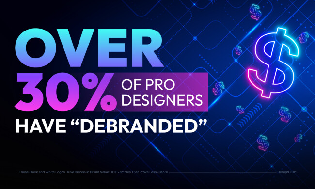
8. Over 30% of professional designers “debranded” a logo (stripping it to basics) in the past year to achieve a cleaner, more modern look.
Many brands even start the design process in black and white to ensure the core logo works in all contexts underscoring monochrome’s role in scalability.
9. Only about 10.6% of the world’s most valuable brands use a purely black-and-white logo with no additional color, but those that do tend to be iconic, enduring names.
10. Brands with consistent color palettes see a 33% increase in brand recognition, and monochrome logos simplify maintaining this consistency across channels.
11. 60% to 90% of people’s judgments of a product are based on color, but monochrome logos leverage contrast and simplicity to stand out effectively despite fewer colors.
12. Black logos are favored in luxury and high-end markets, contributing to premium brand perception and customer trust.
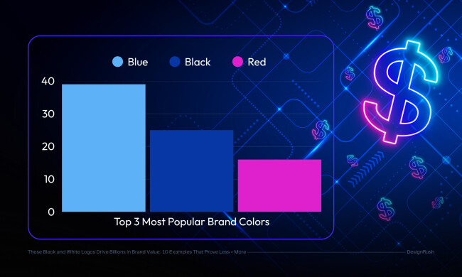
13. Blue is the most common logo color (around 30%-39%), followed by black (25%) and red (16%), indicating black’s strong presence as a key branding color.
Why Monochrome Branding Delivers ROI at Scale
Black and white branding is more than a design preference. It’s a strategic asset for growth-focused organizations.
From cutting production costs to accelerating market entry, monochrome design systems provide brand and agency leaders with a competitive advantage. Here’s how:
1. Reduce Costs and Unlock Operational ROI
- Print & Production Savings: Eliminating color complexity can reduce packaging, signage, and merchandise costs, as fewer ink colors and simpler printing processes lower expenses.
- Faster Launch Timelines: One-color assets simplify legal and compliance reviews, speeding approvals and reducing time to market—critical for startups and global product rollouts.
- Lower Brand Maintenance: Fewer color variables mean less asset churn, reduced regional inconsistencies, and minimized rework, lowering operational overhead.
2. Achieve Scalable Consistency Across Channels
- Cross-Platform Clarity: Black and white logos maintain legibility and brand integrity across digital platforms (app icons, dark mode), print, and out-of-home advertising.
- Design Longevity: Monochrome marks adapt well to evolving ecosystems such as AR/VR and low-light user interfaces, reducing future redesign costs.
3. Signal Trust, Premium Value, and Leadership
- Instant Brand Authority: Black and white branding is the visual language of legacy and premium positioning, used by iconic brands like Chanel, Apple, Nike, and The New York Times.
- Category Fit: Industries such as luxury, finance, legal, and editorial rely on monochrome to convey exclusivity, reliability, and timelessness, aligning with market expectations and consumer trust.
4. Support Growth With Strategic Brand Flexibility
- Launch Fast, Evolve Later: Startups benefit from validating core identity with monochrome logos before introducing color complexity, enabling agile brand development.
- Minimize Risk of Rebrand Fatigue: Black and white logos scale with the brand, reducing the need for disruptive redesigns as the company grows.
5. Streamline Stakeholder Buy-In and Agency Efficiency
- Fewer Creative Bottlenecks: Simpler, monochrome logos reduce stakeholder friction, accelerating board approvals and decision-making.
- Demonstrable ROI for Agencies: Agencies leveraging monochrome systems can quantify operational savings and brand clarity, shifting their role from creative vendors to strategic partners.
How to Design a Black and White Logo That Works Across Channels
Agencies designing for scalability, compliance, and multi-market clarity should adopt a monochrome-first approach:
1. Start in black and white. If a logo doesn't work stripped of color, it's structurally unsound. Use monochrome to test core geometry and scalability.
2. Use bold, high-contrast elements. Avoid ultra-thin lines or intricate detailing that disappears on varied backgrounds. Opt for clean shapes and optical balance that hold on both dark and light surfaces.
3. Test reversibility early. Ensure the logo is legible and effective when reversed (white on black), on transparent overlays, in watermark form, or embossed. Real-world deployment depends on this flexibility.
4. Build a modular brand kit. Center your identity system around a black-and-white primary mark. Introduce color variants as secondary, campaign-specific assets—not as the default.
When to Recommend Black and White Branding to Clients
Knowing when to push for black-and-white design isn’t just a creative decision—it’s a strategic one. Ideal scenarios include:
Early-stage startups
Speed up brand validation and delay color commitment until audience fit is clearer.
Luxury rebrands
Retain elegance and equity while signaling modernization or restraint.
Legal, editorial, and finance sectors
These industries prioritize clarity, legacy, and credibility—exactly what monochrome evokes.
Brands with high physical distribution
Whether it’s signage, packaging, or uniforms, monochrome minimizes asset inconsistencies across regional or vendor lines.
How Agencies Use Black and White Logos to Win Clients
Top-performing agencies don’t treat monochrome as a style—they position it as strategic infrastructure:
Pitch simplicity as scalability
A logo that works in black and white is platform-agnostic: it’s readable in print, digital, motion, or even embossing.
Highlight operational ROI
Black and white reduces print costs, accelerates localization, and simplifies legal approvals—saving clients time and budget.
Leverage aspirational case studies
Use Apple, Chanel, or Jordan Brand as proof that legacy and modernity converge in black and white systems.
Give stakeholders decision confidence
In boardrooms full of undecided execs, a high-contrast logo delivers what color often complicates: clarity, conviction, and finality.
Pitch Line to Steal:
“If it doesn’t work in black and white, it doesn’t work. This is your foundation, not your fallback.”
The Wrap Up: Why Black and White Logos Still Deliver in 2025
Color trends fade. Platforms change. But a black and white logo endures. It scales faster, costs less, and builds trust without saying a word.
And a black and white logo is a stress test. If your logo only holds up when dressed in color, it’s not brand-ready, it’s a liability.
The brands dominating today’s market didn’t gamble on aesthetics. They engineered for scale, clarity, and control.
From Chanel to Jordan, the formula’s the same: strip it down, sharpen it up, and make damn sure it works in black and white first. Because in 2025, it’s not about standing out louder. It’s about standing up stronger — in any context, on any channel, at any size.
Black and White Logos: FAQs
1. Are black and white logos still effective in 2025?
Yes. Black and white logos remain one of the most scalable and cost-effective identity systems today. With the rise of dark mode, minimal UI design, and global digital rollouts, monochrome marks offer clarity, adaptability, and strong brand recall, without the production friction or inconsistency of complex color systems.
2. Why do luxury and tech brands prefer black and white logos?
Luxury brands like Chanel and Prada use monochrome to signal timelessness and restraint, while tech giants like Apple and Nike use it to achieve speed-to-market, omnichannel compatibility, and strong global recognition. Monochrome logos allow these brands to scale visually without compromising trust or visual coherence.
3. How do black and white logos impact ROI?
They reduce packaging and print costs, accelerate asset approval, and improve brand recall. For example, brands like Jordan and WWF have achieved high campaign performance and revenue growth, in part due to logos that work instantly across merchandise, media, and cause-driven campaigns — all without relying on color.

-preview.jpg)


-preview.jpg)